What are the conventions of titling in your genre, and how did you follow or challenge them?
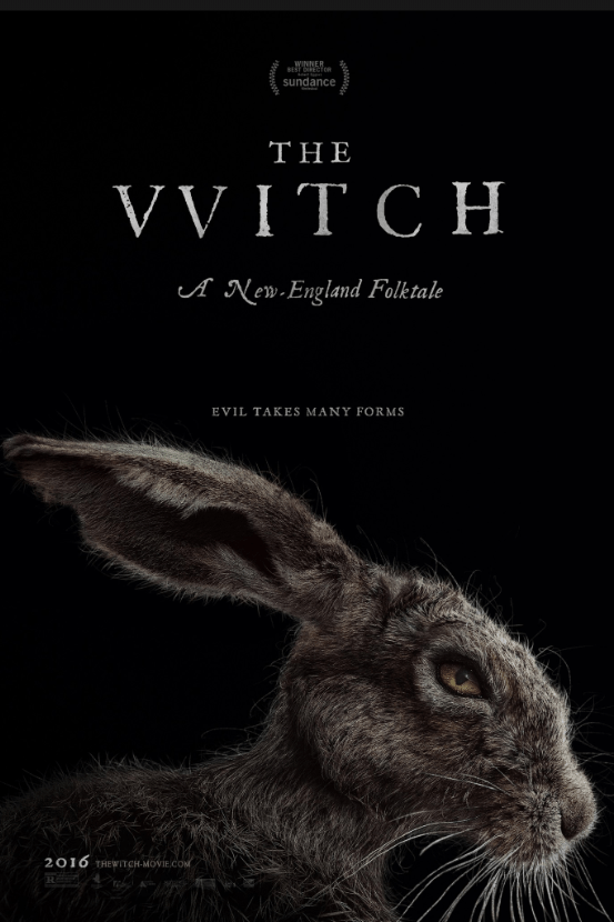
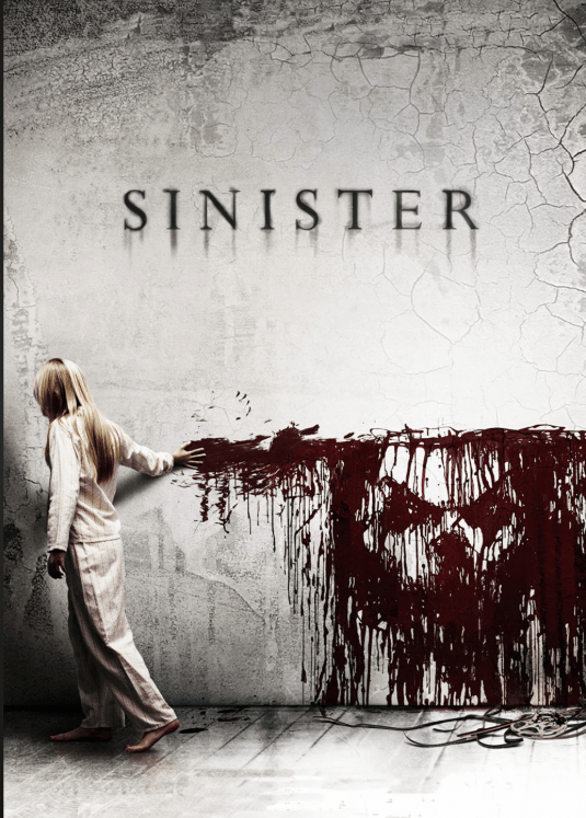
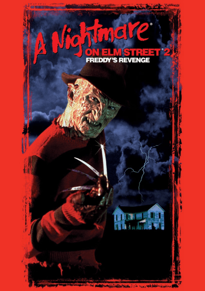
Conventions for titling in the horror genre includes capital, bold lettering. It varies to which type of horror it is, for example, a slasher film or a psychological film. For slasher films they usually consist of altering the lettering like having blood seep down or having rough edges whereas other horror films consist of some sort of a Times New Roman font. Horror movie titles never have any lower case letters, but rather bold and highlighted fonts to gather the attention of viewers. The titles also correlate to whatever gruesome or eerie image is settled on the movie poster and have a color scheme. We set our eyes on a Times New Roman font to be included in our film opening for our movie title and credits.